
'End of Line' gets a new look!
If you’ve ever visited ‘End of Line’ before, you’ve undoubtedly noticed that the site looks completely different today.
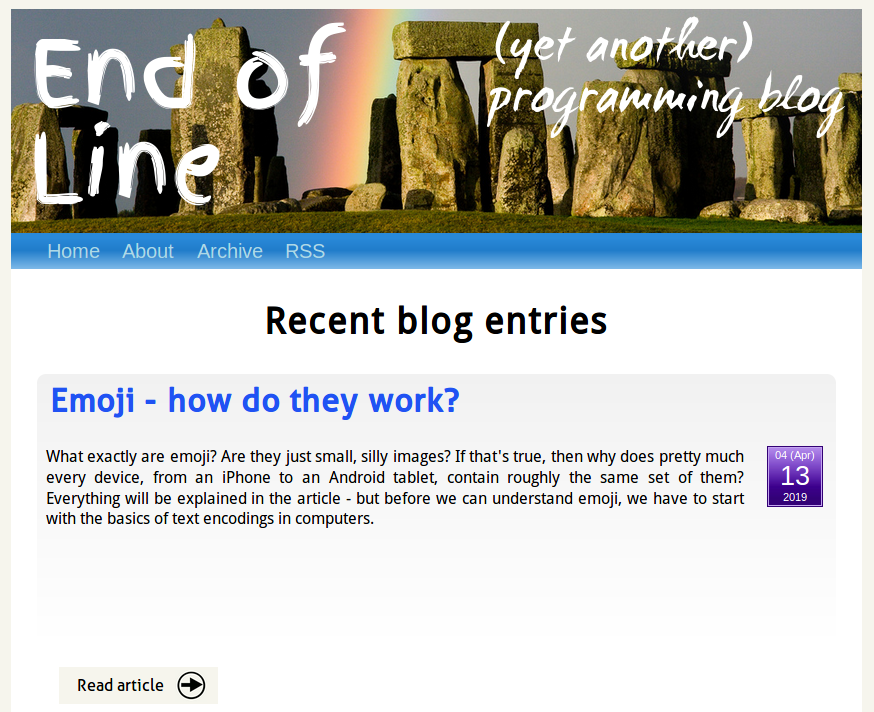
Yes, after years of the blog resembling a GeoCities website from the late 90s, I finally took the time to completely overhaul and modernize all of the page styles. The familiar Stonehenge masthead picture with the blue navigation bar are gone, replaced with a responsive, two-column layout complete with my portrait photo.
The old style has been on the site since it launched in 2014. It was a different time – the blog was just starting, and didn’t have an audience. I was basically writing things down for myself to read later. Even my wife (girlfriend at the time) couldn’t be bothered to read the articles (in her defense, she’s not a developer, and the blog isn’t exactly brimming with raving non-technical content).
I decided to use Ruby on Rails as the tech stack powering the original version of the site, which I had zero experience with at the time. Since I was treating the whole endeavour more as a learning opportunity than a serious attempt at starting a blogging career, I said to myself: “Hey, wouldn’t it be fun to also do all of the CSS for the site from scratch?”. While I’ve been doing web development for quite some time in 2014 already, it’s very rare that you have the opportunity to work on a project with a completely blank slate for its styling. For maximum effect, I decided not to use any pre-created theme, or CSS framework – not even something relatively lightweight like Bootstrap.
The experiment ended in success – the blog launched in September of 2014, almost exactly five years ago. In the process, I learned a ton about laying out a website from scratch. However, I’m a developer, not a designer – a fact painfully obvious to anyone visiting the blog and seeing how it looked. My decision not to use a theme or framework only exacerbated the problem. I also didn’t pay enough attention to making it responsive, and so the page looked like crap on mobile devices.
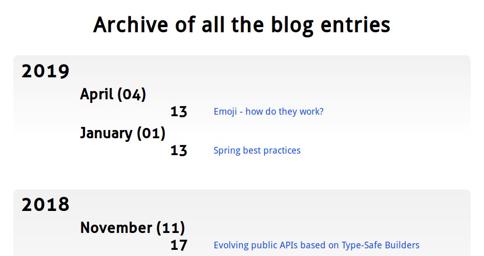
As the years went by, the blog was starting to shape up. The audience grew steadily, fueled by articles such as ‘GitFlow considered harmful’, ‘OneFlow description’ and, recently, ‘Spring best practices’. The more the traffic increased, the more I was embarrassed by the site’s amateurish look. It was bad, but passable, when I was writing just for me; now with an increased viewership, it was becoming a hindrance.
The redesign is long overdue: I first mentioned it in an article reviewing 2016 for the blog, as one of the goals I wanted to accomplish in 2017. I slipped by only two years on achieving that goal, but hey, late is better than never.
You know the saying “Good artists copy; great artists steal”? Well, I was definitely a great artist during this project, as I “took inspiration” from many programming blogs I frequent:
- Michael Lynch’s blog, and the Minimal Mistakes Jekyll theme he uses
- the m10c theme for Hugo
- the blog of Maciej Hirsz
- Gregor Riegler’s site
While I never found one theme or site that looked exactly like I wanted, I mixed and matched elements from all of the above to produce the final result that I’m happy with.
I also made a conscious effort to test the site on a variety of mobile devices before launching, so (hopefully!) the days of the blog looking like crap on phones and tablets are behind us.
The fact that the blog is now
powered by Metalsmith
paid dividends yet again.
I was easily able to switch the code syntax highlighting to be server-side,
as doing it client-side is just wasteful for a static website,
using a Metalsmith plugin.
I also wanted the inline code elements (text in single backticks (`) in Markdown)
to have identical styling to code blocks
(things enclosed between triple backticks in Markdown).
Because of the flexibility Metalsmith gives you,
I was easily able to add a class to each generated <code> tag that Prism.js,
which I use for syntax highlighting, expects:
markedRenderer.codespan = function (contents) {
  // shell-session is the most neutral choice
  return '<code class="language-shell-session">' + contents + '</code>';
};
I’m sure the styling is still far from perfect – the margins for headers seem to be a bit too large, the vertical padding inside blockquotes is too wide, etc. But that’s OK – I’ll make small tweaks to it as time goes by, and even in this form the current CSS is light years ahead of the previous look.
I’m thinking of doing a few additional small changes to the site after this – for example, adding “Previous” and “Next” links at the bottom of the articles, and maybe buttons to easily share a given story on social media. Now that I got rid of code syntax highlighting using client-side JavaScript, I also wanted to make an AMP version of the site.
Let me know how you like the new look of the site in the comments below, and what do you think of my additional ideas – if you have any suggestions, on either of those topics, I’m all ears! Also, please let me know if you notice any rendering issues with the blog after the redesign: styles for an element being off, something looking weird, etc., especially on mobile devices.